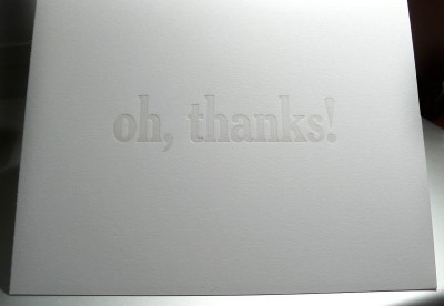
Letterpress: "oh, thanks!" Cards with Gradient
October 28, 2008
I obtained some transparent white ink today. I had had this brilliant idea that I’d print thank-you cards in the blind (that is, with no ink whatsoever) but even when I was doing a blunt-force amount of impression it just wasn’t enough, so I printed them tonight using a mix of transparent white plus just a bit of black.
Inadvertently I ended up with a “fading” gradient effect, wherein the bottoms of the letterforms were darker than the top, but I decided that I actually liked this and it wasn’t just laziness at makeready.
These are set in 60pt. Cheltenham Condensed. I made 25 of them. I needed to thank a lot of people for being so nice to me on my birthday.
Update: There has been some (surprising) significant interest in these cards. I initially made a very limited run of 25, and have used about eight for my personal purposes. If you’d like some, I’d be willing to print more if you make it worth my while in some trivial way! Let me know.
5 Comments
Related Posts
- Letterpress: Little Prince Cards
November 10, 2008 - Letterpress: "I apologize!" Cards
November 10, 2008 - Letterpress: Business / Personal / Calling cards
February 1, 2010 - Letterpress
May 7, 2008 - Letterpress: First Project Teasers
September 23, 2008


pretty!!
Yay. :-)
I’m very curious about the gradient: do you know how it happened? Could you do it again if you tried? I don’t believe I’ve ever gotten that effect, and can’t think of how one would, frankly. I’ve done “rainbow rolls” in other printmaking, but with the ink table spinning between impressions (I presume yours does as well?), I’m having a lot of trouble imagining how you’d get a gradient in letterpress.
And yes, letterpressed thank you cards rock. I made a stack myself at one point, and it’s really nice to be able to give them out… Urgh, now you have me wanting to buy a press (and everything that’d go with it… though I do already have a few fonts.)
Do I know how it happened? Likely a combination of a few things:
1. My platen might not be perfectly balanced vertically, such that the bottom of the letterforms are actually closer than the tops. An alignment sort of thing you wouldn’t see on smaller type.
2. Rollers might be part of it. They ink from bottom to top and might be slathering more ink on the bottom than the top.
3. Transparent inks just behave differently.
1 & 2 can be said to be “faults”, that is, not generally desirable things. So, there may be future projects in which this becomes and issue and then I’ll have to try to fix it.
Cool, thanks for the thoughts…
One further thought from me, on “faults” in art, in general: if it’s something you can control, i.e. get it when you want it, and not get it when you don’t want it, then it’s *all good*. :-)
I guess that’s part of what leads me to such questions — I like to figure out how I did something when I like it but it’s not the norm, so that I can both do it again when I want to, and avoid it when I want to… Do you ever have that, too?
Wow. Beautiful! What a happy accident.