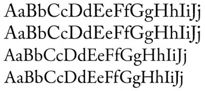
Letterpress: Committed to Caslon
August 28, 2008
“When in doubt, use Caslon.”
–Traditional Printer’s Adage
Today I ordered my first ever fresh foundry type, from M&H in San Francisco. To do this I talked on the phone with Louie. Another M&H rep said Louie had worked there for 58 years. While this is a mathematical improbability, Louie knows his stuff. I will soon have a run of 12-on-14pt. and 18-pt. Caslon, and I intend to build my core around this type.
Caslon seems like an appropriate choice for several reasons:
- Historical relevancy: Caslon was cut in the 1730s by English type designer William Caslon. It’s a Baroque face–faces, really, there are dozens of fonts that go by the Caslon moniker–that has stood the test of time, and was designed in an era when printing was three-dimensional. Of course, that goes for any type designed before the middle part of the 20th century. But still.
- Flexibility: Caslon is a stolid, unassuming typeface that can be plunked into a lot of situations and won’t look flustered. It doesn’t scream its own personality so much that you get distracted.
- Extensibility: I have more chance of finding more Caslon–small caps, titling figures (that is, “capital” numerals as opposed to “lower case” numerals. Sorta.), quaints and ligatures (e.g “ff”, “ffl”, etc., which are cast as one character instead of two or three)–than other fonts. It’s common.
- Taste: I’m fond of it. Though it did run a close heat with Garamond. I actually like Garamond, a Renaissance face, just a tiny bit more, but it’s slightly more delicate and finicky.
The “12-on-14″ bit means that, to account for Caslon’s long ascenders and descenders (the lines on “d”s and “p”s and th like), M&H recommends getting the 12pt. version on 14pt. type. The appearance of the font is that of a 12-pt. font but takes advantage of the extra space available on 14pt. sorts. It sounds more complex than it is.
2 Comments
Related Posts
- Letterpress: Caslon has Arrived! And Leading!
September 2, 2008 - Letterpress: Huge Leaps
August 26, 2008 - Book Review: "The Elements of Typographic Style" by Robert Bringhurst
September 8, 2008 - Letterpress: Project, Sorting Spaces
September 8, 2008 - My thousandth book: Fate deems it so
March 23, 2010


I love the Caslon upper C & G.
I am really enamored with the ampersand in Caslon italic. And the ct and st ligatures. Hope I can get those sometime.