Help Me Choose
February 10, 2008
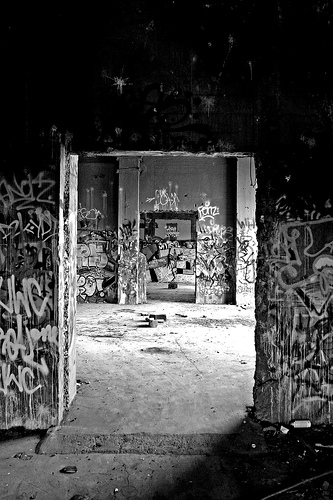
Peat’s presentation on abandoned places in last week’s Ignite Portland (which happened to feature a photo by yours truly) rekindled my intrigue of such places.
As such, I posted a few more photos from the local superfund site I like so much to Flickr, and I’m thinking of printing one of my superfund shots real big-like and framing it.
As such, I need your help to adjudicate the offerings. Here is a link to all of my superfund photos on Flickr. I am leaning toward the ones pictured here, but could really use input. It’s surprising how clueless I am about my own photos: which are good and which blow.
I kind of like the moodiness of the black and white ones, but Mr. Pencil points out intelligently that the color is part of what makes it so visual there anyway.


7 Comments
Related Posts
- Weekend: Abandoned Cement Plant in Lime, Oregon
September 29, 2009 - Superfund Site Revisited
August 28, 2007 - Rescue
June 17, 2008 - New Art, Oh Hells Yes
October 12, 2007 - More Video for You!
May 14, 2008
lyza, I like http://www.flickr.com/photos/lyza/1242292083/, middle one above and http://www.flickr.com/photos/lyza/74928722/ (building) of the color ones best. I think http://www.flickr.com/photos/lyza/74929077/ (columns) is the strongest of the black and white ones. Moody and edgy but absorbing.
Catherine
Second one. The color adds so much. The third is too dark for me. That said, I like the composition of the first, with the door frame, the dark top, and the chaos covering everything under 6 feet.
I prefer the composition of the b&w and I really like the way the gray tones work.
No. 3 has a really otherworldly feel. It would HAVE to be bigger to be effective.
Coincidentally, a crop of the last (darker one) is the header image on the site today (Monday the 11th).
I like the first one here and:
http://www.flickr.com/photos/lyza/75022540/
But mostly the first one here.
Good luck!
The lack of consensus here actually makes me feel better about my own confusion. Thanks for all the great input.
I like the first one as well. I think the bright colors make for an easy target — but the black and white can really capture the mood of the place. It is a eerie, heavy space …